
Friends, it has been a minute since I have done one of these (over five years, if you want to feel ancient). But man, they were fun, and I need some fun, so…. enjoy some messed up covers!
Feel free to check out my other lovely posts about unfortunate covers. We’re gonna go ahead and count this as a discussion too, because hey, we discussing covers, right? 🤷
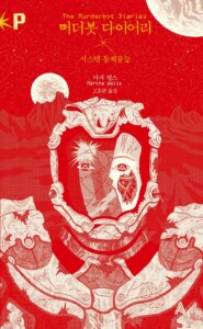
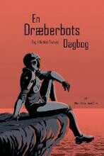
The Murderbot Diaries by Martha Wells


Top L-R: Romanian, Hebrew, Thai (book 2)
Bottom L-R: Korean, Danish, French (Book 3)
BURN IT. Burn the Romanian one before we become its next victim. Murderbot enjoys Netflix and alone time, what is wrong with you guys!? From an aesthetic perspective, the Hebrew cover is actually worse, because it is terrible, but at least I won’t have nightmares? None of the Thai covers for this series made any sense to me, but this one the least. I feel like it is supposed to be a person… dancing? Hopping? No idea.
Oh good, more nightmare fuel, thanks Korean pubs! Stop ruining Murderbot, just because they are a little mudery does not make them bad! Just ask Clarke! The Danish have taken my advice, and instead of terrifying, they went with… contemplative Murderbot sitting on the dock of the bay? Feel free to hum some Otis Redding in confusion. The French one is just lazy. Murderbot is not the Transformers, guys.
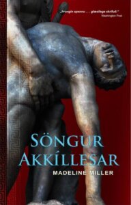
Song of Achilles by Madeline Martin
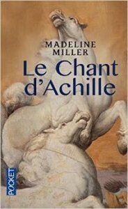

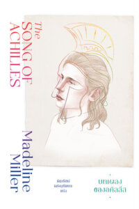


Top L-R: French, French MMP, Thai, Hebrew
Bottom L-R: Icelandic, German, Serbian, Estonian
The French version… guys, no lie, at first I thought this was a giant horse penis. Then, I saw that it was a second horse head (regular head, get your mind out of the gutter), and…. Idk which is worse? And now seeing the French Mass Market Paperback, I am just convinced that the French have a pretty strong vendetta against Ms. Martin. The Thai publishers look like… like they drew a hat on White Jesus? I am so lost. The Hebrew folks just had some extra prints from late-aughts YA dystopians lying around and slapped it on this guy.
The Icelandic contingent decided that dead statues were the way to go, I guess. The Germans let one of their marketing interns cosplay for the cover shoot. The Serbians cared only about… a man’s navel? I am honestly really confused. And if anyone can figure out where the Estonians were going with this… please share with the class.
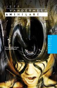
Annihilation by Jeff VanderMeer


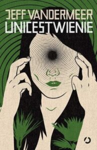


Top L-R: Ukrainian, UK (2014), UK (2015), Romanian
Bottom L-R: Polish, Hungarian, Spanish, Bulgarian
There is truly so much bad about the Ukrainian that I hardly know where to start. Is it the mid-80s graphics? The random snail shell with a landscape inside? Is it the gross font color? The 2014 UK edition decided to forgo all of that for… nothing. This is the most boring, and also illegible book cover known to man. And then I guess someone dared them to make it worse, because in the 2015 UK edition, they decided to make the font even harder to read, while throwing some spores on a red background. 🤷♀️The Romanian one should burn in hell immediately, please and thank you.
The Polish one has a cool color scheme, I’ll give it that. But I do not like that ma’am has a hole in her head and no eyes. Also, because I am 12, I thought it said “Incest Weenie”. Sorry Poland, that is on me. The Hungarian one is just… yawn. I feel like this book is supposed to be thrilling, what is with all the snooze-fest covers? Oh nevermind, the Spanish have come to save the day. This one isn’t exactly boring. The font is crap, and the plant is… again, not boring. I genuinely couldn’t decide if I hated the Bulgarian one. It is not the worst for me, but that eye, man. It’s the frickin’ eye that did me in.
Station Eleven by Emily St. John Mandel


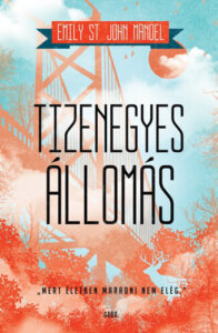

Top Row L-R: Polish, French, Dutch, Finnish
Bottom Row L-R: Russian, Spanish (Castilian), Hungarian, Greek
Sometimes I look at the Polish cover and think I know what they were going for but then… nah. Oh, to be a fly on the wall in the French cover planning! “Well Jaques, it’s the end times, so just… throw a chair on an abandoned beach or something.” They should have, at least, told the Dutch folks that this was not a happy holiday tale? They seem confused. Also confused are the Finnish, because they seem to think that this particular apocalypse is way more lovely and cheery than it is.
Not for nothing Russia, but this is not actually a generic fantasy kingdom novel. Not sure what the Spanish cover artists were going for, but if it was Depression-Era Dustbowl Playground™, nailed it. Frankly, I actually adore the Hungarian cover. It’s gorgeous! It also has literally nothing to do with this book.Is that supposed to be like, the Brooklyn Bridge? I have no idea but they should have saved this cover for literally any other book. Idk what the Greeks are doing- I didn’t see any trumpet-shanks in the book or the show, but.
We Were Liars by E. Lockhart
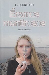


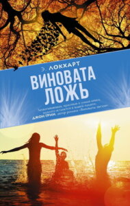

Top L-R: Spanish, Persian, Bosnian, Chinese
Bottom Row L-R: German, Russian, Arabic, Lithuanian
Funniest thing is, I have done this book before. But then other publishers saw those books and were all “hold our beer!” so now we have these monstrosities for your viewing displeasure!
There is genuinely not a thing about this story that warrants the Spanish pubs deciding “random girl blowing bubbles” is the perfect cover choice. I don’t even know what to tell you about the Persian cover. I can’t even fully tell what it is supposed to be, I think maybe the family house? Drawn… inside a guy with a baseball cap’s face? Maybe I am missing something but… no. The Bosnian cover looks like a travel guide to some quaint European castle. Which is fine, but not at all this book. The Chinese cover apparently thinks this is a story about a young Scandinavian war refugee circa 1936.
The German cover is just… yawn. I hate the “random brooding white kids” covers. Hate. The Russian cover, in addition to being fugly, is also… well, it spoils the entire book? The Arabic cover is creepy, and also wrong. The title is “We Were Liars” not “We Were In The Business of Keeping Our Lips Zipped”. The Lithuanian cover went all in one this random girl’s shoulder. We Were Freckled From Too Much Sun Exposure, I guess.
Karen McManus Special


Top L-R: One of Us Is Lying, Indonesian • German/English (Cornselson) • Italian • Swedish
Bottom Row L-R: OOUIL Estonian • Two Can Keep a Secret Estonian • TCKAS Indonesian
Dear Indonesian Publisher, None Of Us Know What These Pictures Are. The folks at Cornelson just phoned this one in, eh? “Teen, but make it blurry. Nailed it, Fritz.” Wow, I missed the plot point in the Italian cover where some scruffy guy… gets facial burns? And we’re back to Generic White Teens for the Swedish cover! I call this one the Ace of Base Special™.
Why did the Estonians highlight this one dude? Was he the One who was lying? Feel like this is misleading but okay. Are the Estonian TCKAS artists trying to… tell us that the secret resides under this girl’s skirt? Whereas the Indonesian TCKAS seems to think that this is obviously the optimal way to convey secrecy.
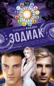
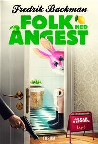
A Few Randoms To Properly Haunt Your Dreams


Top L-R: Dry, Korean • Anxious People, Finnish The Caravaggio Syndrome, US • Glass Hotel, German
Bottom Row L-R: Under the Whispering Door, Slovenian • Malibu Rising, French • The House in the Cerulean Sea, French • Zodiac, Russian
I mean this Korean Dry cover is weird on its own, but… who would stand with their mouth under a faucet if there is no freaking water!? Good luck getting this hellrabbit from Finnish Anxious People out of your nightmares! The Caravaggio Syndrome is a book that is actually being published in our current era 2024, and they chose… this foot fetish situation? Great, thanks, hate it. The Glass Hotel features neither glass, nor hotel. Discuss.
Under the Whispering Door has such lovely covers! This is not one of them. How do you manage to go from quirky house with wonderful colors to… man standing on coffee apparently being steamed to death? How!? If you saw this French cover of Malibu Rising on your internet history, you’d be accusing someone of watching something they weren’t supposed to on your device, full stop. Again, how did we go from the gorgeous covers of The House in the Cerulean Sea to… this? Admittedly not my least favorite of the bunch, but still a hell of a downgrade. And the Russian Zodiac cover… man they just went all in with the Brooding White Kids™. Seriously, I sense a theme, and I hate it.
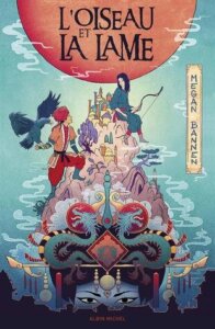
And some lovely gems, because let’s be positive woooo!
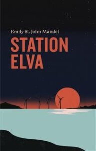


L-R: Station Eleven, Swedish • All Systems Red, Finnish• Seven Husbands of Evelyn Hugo, Indonesian • Anxious People, Swedish
Bottom Row L-R: The Bird and the Blade, French • Annihilation, German • Furious Thing, Russian • Dry, Indonesian
The Station Eleven gives off a great vibe, and is simple but effective. And the colors rock. Murderbot looks both badass and fabulous, which is what I want from any such cover, frankly. I adore the illustrated cover of Evelyn Hugo! Now. Bear with me. I am not saying that Anxious People is last word in beauty, but it is funny as all get out so I had to include it because it made me smile!
The Bird and the Blade is just pretty, full stop. Annihilation is giving me the vibe I wished literally any of those other covers gave- that is the creepy plant junk I want to see! I know next to nothing about Furious Thing, but if you have seen the OG covers… this is brilliant, especially in comparison. Also, the colors! Dry is a hard cover to do well, because it is, well, dry. But the Indonesians sure figured it out!

Some terrible covers up there, but your commentary was fantastic. Thank you for the laughter
I laughed a lot…both at the covers and at your commentary. Admittedly, I haven’t read any of these books, so I don’t have a clue about the covers’ accuracy – or lack thereof – but most are just hideous, full stop. I also can’t understand if the girl on the Korean Dry cover has the faucet passing through her face?
I super love your commentary on these! So funny. Wish you’d include the US cover(s) for comparison I had to go see them on Goodreads haha. Some of these you wonder how drunk the publishers were.
Hilarious! I’ve always loved these posts. I can’t believe it’s been so long!
Wow! Those are unfortunate!! I really did like The Bird and the Blade cover.
5 YEARS? I remember these though. VOTING. Okay Murderbot- the Romanian one IS terrible. Let’s have a book burning. The Thai one isn’t… bad? Weird, but…
I had to vote serbian on Martin. It just looks vaguely… pornographic light? Like, trying to be lurid? The Estonian looks too much like a non fiction mythology textbook.
Yeah Annihilation! I read that one. Agree about the first one- it looks loike the Narada Mystique logo from the 80’s, they were New age music label. Seriously google it. And the Polish one alls I can thin of is a Cyclops? The eye on the Bulgarian one is rather creepy.
Station 11- dang the Dutch are getting NO love in the votes!
The faucet cover.!!!!!!!!
I voted Station 11 but Dry is nice. I love that style.
I’m pretty sure NONE of these artists actually read the book. I vote for “Incest Weenie” as the best worst book cover in this post.
I will need years of therapy after this assault on my eyes. I can’t even pick the worst one, although I will admit that the Danish contemplative Murderbot actually doesn’t make me wanna die, so I might say it looks okay? Everything else is pure nightmare fuel. On the other hand, the Finnish All Systems Red cover is gorgeous 😍 all those colors combined together somehow don’t look “soft” and actually keep the “killer” atmosphere of the Murderbot Diaries but with a dash of style.
Such a fun post. All these people should be fired and find a different occupation entirely.. lol
I’ll just touch on books I’ve read.
The Thai Murderbot is…what exactly??? I don’t get it lol The We Were Liars covers all feel weird or lazy. The Dry is SUPER weird.
Then the random ones – the rabbit and the woman fondling the foot are disturbing lol
So many blahs…..I couldn’t decide, but it was fun seeing all the different covers.
sherry @ fundinmental
Horrid nightmare skeleton monsters can enjoy Netflix and alone time too! 😛 I voted Thai for that one because, though I haven’t read the books, that one seems like it tried the least to have anything to do with the story. The Achilles ones just all look like stock photos with text slapped on. I actually kinda like the Polish and Spanish Annihilation covers. Thanks for the laughs and for including some nice ones at the end as a palate cleanser! I really love the Dry cover.
OMG thank you for this- I had such a good giggle. I adore this sometime-series you do. As a visual person who has been known to buy a book purely from its cover, I can’t fathom what book-buying in these countries must be like. I think I’d be constantly disappointed that the cover designer is so clueless.
The Hebrew version of Murderbot looks like a Choose Your Own Adventure, but the one for Song of Achilles?? At least all the others were Greek-ish in concept (and not depicting a *child*).
I don’t want to read Annihilation- all those covers make me make an ick face. But th UK one, where they decided to make the title and author a little circular stamp, where an award would go? FIRED.
I got the biggest laugh out of the Dutch Station Eleven. I’m guessing a native English speaker saw the Dutch title and forgot the realize that translation is a thing. By the time their boss saw it, it’d already gone to print. Or maybe it’s a metaphor. Does anybody here speak Dutch? Does it say “have yourself a merry little ‘poc’lypse” anywhere?
I do think now that trumpetshanks should be a thing, though.
The Persian cover of We Were Liars bothers me- not because it’s so off-topic, but because it sets my artistic eye-teet on edge. If they just moved the positioning of the house UP and made it 30% smaller…
So…One of Us is Lying is The Breakfast Club meets post-apoc thriller meets 90’s vampire teen drama meets pr0n meets 80’s Aha music video?
My first thought on seeing that Slovenian cover was “Is there a new TJ Klune novel about over-caffeinated pixies??” 😀
What a fun post! Although it’s a little overwhelming, lol. My eyeballs are jumping out of my head! There are some truly dreadful covers here, but I do love the last section, especially the Martha Wells book😁