
Raise your hand if you are, once again, in a terrible creativity slump. Oh look, it’s me:

So the last time I had no creativity (or let’s be real, ambition) I did some lovely posts about unfortunate covers. Frankly, they’re fun to do, and they require me only to be judgy about book covers, and I think all of us can appreciate that. Oh, and you get to vote on which ones you hate the most, so there’s a win!
Warm Bodies by Isaac Marion


TOP L-R: US Audio, UK, Turkish, Russian
BOTTOM L-R: Dutch, Indonesian, German
His skin is legit falling the fuck off in the US Audio. And really, I don’t think that this book needs The Walking Dead treatment? The UK is just boring, basically. I have no idea what is going on in the Turkish edition. I’ve looked at it from several angles and come up empty. As usual, the makers of the Russian book haven’t bothered to read the source material. The Dutch also have some reading comprehension issues, because I don’t think R was 35, and I also don’t think he was starring on The Undead Bachelor, so. The Indonesian one can’t decide which genre it wants to be so it clumped a bunch together for good measure. And I haven’t enough words for The German edition.
We Were Liars by E. Lockhart


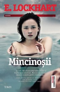
L-R: Vietnamese, Swedish, Russian, Romanian
Where to start with the Vietnamese cover? Look- it isn’t bad from an aesthetic perspective. But it’s both wholly misleading and completely spoilery at the same time? The Swedish one again, just based on looks alone, isn’t tragic. But it also doesn’t fit the vibe at all. Who is surprised that the Russian cover guys didn’t bother to open this one? And copied the TFIOS movie poster? The Romanian cover looks like it belongs on an episode of “To Catch a Predator”, so nice job creeping everyone out.
Looking for Alaska by John Green


L-R: Italian, Swedish, Polish, German
To be honest, I cannot decide if I love or hate the Italian cover. I mean… it’s kind of clever? Though I haven’t a clue what it has to do with anything, so there’s that. It’s not my least fave, anyway. Why, Swedish designers? Why? This is a YA book, not a snuff film cover. As for the Polish edition… who even are all these people on the cover? Are there multiple Alaskas? What is happening? And German cover dude, way to phone this one in.
The Darkest Part of the Forest by Holly Black

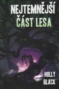

L-R: Russian, Czech, German
Hahahhaha there is no way that Russian doesn’t win this poll. Honestly the other two don’t even stand an almost chance. Do you have eyeballs? Please, join me in laughing so hard tears are running down my face. Come on Russia, did Holly do you dirty? I feel like she doesn’t deserve any of this.
Under the Never Sky by Veronica Rossi


L-R: Greek, Hungarian, Russian
Look, the girl on the Greek cover is dressed really nicely. The background is blue and blue is nice. Here’s the thing: This book takes place in a dystopian wilderness, and I think they barely had shirts, let alone ballgowns? Also, this dress low key looks like milk. Hungarian cover designers let their kindergartners dabble in Photoshop, methinks. Also that woman is older than me, and I think Aria was like 17? I am flat out dying at the Russian cover. It’s… in in space. The book is decidedly NOT in space. Nor are there skyscrapers. I mean, we could play a game and see how many things we could find wrong with this, but it may take all day, so.
Let us discuss! Which of these is most offensive to your eyes and/or sensibilities? Any that you think aren’t bad?
Discover more from It Starts at Midnight
Subscribe to get the latest posts sent to your email.

Voting! Cover democracy in action. Okay let’s see- I had to go with the US audio of Warm Bodies. I just don’t like it? But the Turkish one is horrendous. We Were Liars!! I went with the Russian one, not a horribly ugly cover but I just don’t like it. We were Liars is not a fluffy YA! The Italian cover of Alaska is creepy AF to me?
That Russian cover of Darkest Part is horrible. You called that one! And… the Russian cover wins… er, loses?- again for Never Sky. Haven’t read it but from what you say, they just went WAY outside the book for that cover!
It is GROSS because like… think of the flesh falling off the TWD zombies, and then imagine holding its damn hand! NO. I went with “Mr Zombie” because it’s lazy and not even representative of the book! I almost went with the Russian We Were Liars, but I am too creeped out by what looks like a little kid on the Romanian one, yikes. The Italian Alaska IS creepy, which is why I can’t decide if I love it or hate it ? (Though it definitely does NOT fit the book at all.)
SAME for both Russian covers- what even, Russians? This could have been an entire post about shitty Russian covers, let’s be real. Under the Never Sky is like, a dystopian, but also probably post-apocalyptic? And most of the book is set in the damn woods, trying to find food and shit. Almost like Divergent-ish. NOT in space or… whatever is happening in that cover!
OMG, I love your comments of the covers, they made me laugh so hard 😀 Russian Warm Bodies and Romanian We Were Liars are the worst!
Aw thanks!! And seriously, those are SO BAD, gah!!
Love this feature and your commentary. These are some pretty bad covers. The Russian We Were Liars “TFIOS” cover is so bad!!!
Aw thank you!! HA right, especially since those books are NOTHING alike in any way! What even, Russia!?
‘Also, this dress low key looks like milk.’ – That made me laugh out loud at work. I hope you’re happy.
This is one of my favourite features on your blog, Shannon. Some countries produce absolutely beautiful covers when they translate books, some of them do this. Seriously, what is wrong with these covers? I haven’t even read Looking for Alaska but that Polish edition is so hideous I don’t even want to look at it. What were the designers thinking?
Bwhhaha I won’t lie, I AM pretty happy ?
AW you totally made my day, thank youuu! And seriously though, like, I don’t put covers on that are just bad- they have to be SO bad, to the point where you know that no one even tried, or read the source material! (I do low key feel bad about making fun, but then… they need to get their act together sometimes hahah)
Omg I’m laughing so hard. ?? I feel like the need for cover designers to be hired overseas is…a real need.?But holy heck to the Looking for Alaska covers?!? The one of the girl holding her leg by the pool or whatever??? I mean. That’s the kind of photo I take on accident.? And THAT RUSSIAN DARKEST PART OF THE FOREST COVER HOLYYYY HECK.? I’m dead. So dead.
This is great ahh hhaah. (I mean, it’s sad you’re in a bit of a blogging slump, but you do a fab job always!! Just saying!. *sends cake* )
Right!? Or not even cover artists, I feel like fans would do a far superior job? Just think of the awesome people we have here in the blogosphere- but honestly anyone who actually read the books would be a step up at this point! BWHAHA exactly, like how is “leg by a pool” a good book cover for ANY book, let alone Looking For Alaska which has… nothing to do with anyone at a pool even? That Russian Darkest Part of the Forest was a freaking GIFT to me, basically. When I saw it… while I almost cried tears of laughter and joy. I assume Holly Black did not ?
Aw thank youuuuu! That makes me feel better honestly! Blogging slumps are HARD. I can write about stuff a little, as long as I don’t have to come up with actual topics? So that’s where I am at hahha. I shall gladly accept the gift of cake thougH!
Oh geeze. None of the Under the Never Sky covers are as pretty as say, the US one.
Nope, I agree! And they don’t make sense, either hahah
OMG these are unfortunate. I’ve never read The Darkest Part Of The Forest, but that Russian cover would not make me read it. That cover would make me turn the book around so the sheep-man wasn’t staring vapidly at me anymore. What is going on with the Looking For Alaska covers? The first one is bizarre and the last one is an accident. The Warm Bodies covers are the worst. Who would call a book Zombie, I’m In Love?!
Bwhaha can you even imagine running into that nightmare at your local bookstore!? ? I cannot with any of these honestly- what, if anything, was anyone thinking!? Especially the random title changes- how would anyone even know what these ARE!?
That first Warm Bodies audio cover is CREEPY and not in a good way. The Russian DPotF made me laugh and I do not understand the Italian LfA cover at all – but I haven’t read the book.
Karen @ For What It’s Worth
Bwhahah right!? Sometimes creepy is good. This is NOT that time. I still am cracking up over the Russian DPotF, so I feel you ? The Italian LfA makes NO SENSE in context whatsoever. Which is why it is so completely insane!
Dude, the Russians are KILLING it. It really makes me wonder what cultural elements and variables affect how different marketing teams around the world gear their book covers. Great post once again, Shannon!
I honestly think that the cultural element is “we don’t give a fuck”. I mean, I have BEEN to Russia, I don’t think they’re that clueless? I think they literally could not care less? I try to be like, considerate of the possibility of cultural differences with these, but wow, the Russians just phone it in hahah.
That’s so cool that you’ve traveled to Russia! It’s on my (ridiculously long) list of places to see. It really is strange though. With the exception of their Under the Never Sky cover (which looks like some work thought went into it (even if it did get the setting completely wrong)), the rest here are just BAD, lol.
I’m most upset about how Romania messed up that cover hahaha. Why Motherland?!
Bwhahah seriously! The good news is, Romania doesn’t make the list too often, so I suppose this one can be overlooked 😀
Hahaha phew! Well that’s a relief!
Oh gosh. Unfortunate is…quite an accurate word, isn’t it? I’m honestly flabbergasted that some of these are even put out by professional publishing companies! Those Under The Never Sky covers are just…well, they sure are something. It’s so odd how many covers are out there that have NOTHING to do with the book itself!
HA right? I mean… someone actually had to “design” these, and I am using the term VERY loosely! That is what kills me- they don’t fit the books at all, so…. just why!? I mean, I’d be okay with simple covers if they had anything to do with the books- but some of these clearly took time AND made no sense!
Oh my God, these covers are…. well, really unfortunate hahaha. I am SHOCKED about the first Looking for Alaska cover, the Italian one… like, wow haha, I just hate it haha. Also, I’m not a big fan of all of the We Were Liars covers ,they’re all so… strange and yes that last one just creeps me out hahaha.
Loved this post 😀
Aw thanks! Seriously, I actually had to double check that it even WAS Looking for Alaska because… what even!? Some of them are just disturbing hahah
ALL o the Holly Black covers are tragic. And I don’t mind the We Were Liars Vietnamese covers, but like you said, it’s misleading and has some spoilers!
Yep! Like- I like the *look* of the Vietnamese one but… not for that book! And poor Holly Black hahha
What a great topic idea! The We Were Liars covers are scary looking.
Aw thanks! And right!? And not in the way they”re meant to be haha
Oh my god the Indonesian cover for Warm Bodies is soo bad! I mean aesthetic wise maybe it’s okay, and changing the title to “Zombie In Love” is definitely cringy, but the worst part is the tagline! “Die without you, live for you” LIKE OMG STOP I’M ASHAMED I’M SORRY
I’m convinced that international book cover designer is the easiest job in the world. No art skill necessary, no understanding of the material necessary, and apparently no understanding of your key audience necessary. The worst is still the Turkish Warm Bodies cover- is it just me, or does it look like the girl is being raped? Yikes.
There really are some unfortunate covers here! 🙂
I really don’t know what’s going on with any of the Looking for Alaska covers! And is it me or does the Romanian cover for We Were Liars look like some strange, slightly creepy magazine cover?
I totally get the no creativity slump – I have posted twice in the last 2 months. This was a great idea and interactive.I am stil chuckling over the milk dress! The absolute worst is the Turkish cover of Warm Bodies -all I see is a potential rapist.
Your color commentary is so fabulous! I cackled at one point. Score 1 for you! It is annoying when the covers are generic. It should be a requirement that the designer read the book or talk to someone who read the book.
The Looking for Alaska books really look awful! ughhh! ALL OF THEM!!
YIKES. MY POOR EYES.
Some of these are AWFUL but the worse for me has to be that creepy ass doll! Can we not with weird dolls on book covers??
BWAHAHAHAHAHA YOU’RE KILLING ME, SHANNON! xD Especially with all your comments on the Warm Bodies covers. The Veronica Rossi covers are the worst, IMO, in terms of visuals. They all kind of look like someone who got way too excited to have downloaded Photoshop for the first time made them? The first We Were Liars cover’s super pretty, though!
I LOVED THIS POST! Don’t ever claim that you don’t have creativity because this is awesome! Plus, I can only imagine how long it took to investigate all of these international covers (and to recover from seeing some of them). Even on your “bad” days, you are so amazing and inspiring.
Now, if I am going to be completely honest, I like the German cover for The Darkest Part of the Forest. It is still a little cliche and still not as good as the US edition, but compared to the others it is the least of all designing evils. I also appreciated the symbolism on the Italian cover. I definitely agree that Alaska is more like a doll in the novel than an actual person.
HAHAHAHA Omg Shannon I enjoyed this post so much and voting on my favourite covers that were the worst (and seeing how everyone else agreed)! Gosh there are some truly terrible covers out there, what are they thinking?
Yay another post about terrible book covers! Ok I need a whole paragraph for Warm Bodies because wow. The German edition is just… so bad. And you’re right, I don’t even know what’s happening on the Turkish one. And “As usual, the makers of the Russian book haven’t bothered to read the source material” is cracking me up so much. The Indonesian one looks like a bad romcom. I actually think the US Audio cover captures the book fairly well though, and the UK one is plain but nice to look at (though maybe that’s just cuz I love the color red).
I have no idea what We Were Liars is about, so I just like the art on the Vietnamese cover. I also like the German Holly Black cover! But again, idk if it fits the book well or not.
That last Greek cover really does look like milk! LOL I think I voted with the majority for all of these but one, so it looks like most of us are in agreement on some of these horrible covers.
-Lauren
http://www.shootingstarsmag.net
Ahh the cringe though, I can honestly say that when it comes to international book covers and translations of book titles, the Greek ones are a disaster! They almost never get the title correct and the cover art is just cringey, the main reason why even though the books are cheap AF (the older publications at least) I never buy them because the embarrassment!
I don’t remember most of what I voted for, but the Turkish Warm Bodies.
Something about it is just off and creepy. The others were bad, but just *meh*.
Who doesn’t love horrible covers? I have to say there are a lot of terrible covers for Warm Bodies. The We Were Liars ones aren’t bad, I kind of like the Vietnamese and Swedish ones but you’re right that they aren’t totally fitting. ones a little spoilery and the other gives you totally the wrong idea about what you’re gonna get from the book. Who knew a John Green book would get so man unfortunate covers? I feel like a popular author should put their foot down and ask for something a bit better. Poor Darkest Part of the Forest, such a good book deserves far better covers! Why would the Russians do that? And let’s not even start on the Under the Never Sky covers, were they even trying with some of those?
That Hungarian cover for Under the Never Sky totally looks like it could be a police procedural! 😀
This post made me laugh so hard! Your comments on each cover was so perfectly snarky. For feeling uncreative, this is one of my favorite posts of yours and I hope there will be a part 4 some time in the future.
I hate all of those John Green covers, I can’t even pick a least favorite out of them. Same with Under the Never Sky. All of those are so fucking bad, omg. Okay, but that Russian The Darkest Part of the Forest cover is killlllling me. OMG. Why are the Russian covers THE WORST?????
Oh man, these are honestly so cringe-worthy and just painful to look at haha.. Those Under the Never Sky covers look like they were made in Paint XD And oh my god, the Russian TDPOTF….. what even…
Fabulous post,, as always <3
Brittany @ Brittany’s Book Rambles
I absolutely love these posts! I actually didn’t vote for the Italian cover for LfA, but every time I scroll past that creepy doll face, I get the heebie jeebies, so I definitely think I should have.
This is SUCH a fun series, Shannon. Some of these ‘Alaska’ covers are REALLY (really) unfortunate. 😉
Russian are the worst. For me, Holly Black’s German cover is one of the best.
The Turkish Warm Bodies cover looks like he’s possibly sexually assaulting her…
The Vietnamese cover for We Were Liars is beautiful from an aesthetic perspective, though but was meant for something else. ?
I’m laughing so much at the Russian cover of The Darkest Part of The Forest. ?? What in heaven Russia!? Same goes for the Under the Never Sky. ?