Ah, the dreaded cover change! Whether it’s a mid-series (those are notoriously the most evil) to a new paperback cover, they can make us squirm. I am not going rehash all the worst of the worst, because they’re pretty notorious (I mean, remember when they tried to change The Winner’s Curse? Those… were perfection, just why?!) Instead, I want to talk about the few, the underappreciated, the cover glow ups! Yes, these are those rare unicorns for which a change made things much much better.
Sometimes this happens before the book even comes out, but a lot of times it’s a switch when the paperback comes out, and there are even a few (gasp!) mid-series changes here! And… you get to vote on whether you think I am right!
(Just a note: These are all US editions, because it would get way too confusing to throw others into the mix!)
(An additional side note: yes, I did this post before. Yes, I copied and pasted. But the covers and polls are new, promise!)
I am so thrilled that this series got a mid-series cover change, which I cannot believe I am saying, but here we are. The colors are better, and it’s just so much more unique than “generic girl looks at camera badassedly” or whatever it was they were going for here.

Loading ...
I have loved this series since the first book first came out. So, a long time. But the covers were… meh. But NOW? Did Shannon buy every one of these new covers? You bet she did! (Also read the series- the
first is free on Amazon!
Loading ...
Okay so the before wasn’t
bad by any means! Heck, it’s probably tied with the other one I claim is my favorite as my favorite of the befores! But look, I just freaking
love the new ones. The colors pop, the snake is still there, and the font is awesome.
Loading ...
Do I love the new one? No. But do I love it in comparison to the old ones? Very yes. Look, they are still not my fave, but at least the new ones look… kind of cool in a fun vintage way? Whereas the old ones just look old in the late aughts way.
Loading ...
So again, the hardcover didn’t like, hurt my eyes or anything, but it was just okay. The new ones have much better use of color, which makes all the difference for me.
Loading ...
I love when a weird silver heart is a glow up, don’t you? I love that it offsets the heart with the flowers, and so glad they kept the font (which was the best part of the OG, clearly). I approve.
Loading ...
Okay, in fairness, the new one is only okay. But the old one is so unappealing that it’s definitely a glow up. I mean- the first one looks like a teen romance on… football turf I guess? It’s a space story for goodness sake! At least the new one reflects that!
Loading ...
I hate people kissing on covers. I just do. I
do, however, adore bright colors, kitschy fonts, and cutesy illustrations.
Loading ...
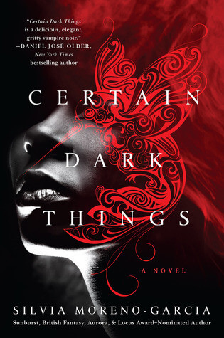
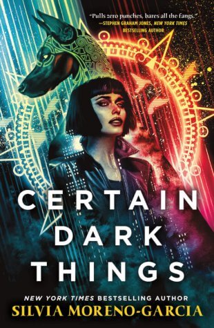
Silvia Moreno-Garcia has made a recent deal with the Cover Gods, and has been
slaying on every cover of every book she’s written (or in this case, re-released). Idk what the book is even about, but I need to know after staring at this cover!
Loading ...
I will admit, this before is my favorite before on the list (along with that other one). But, I still like the new one better. ?♀️
Loading ...
Okay, sure, I bet the old one fits the story in some great way. But I want the fun colors of the new one, and I shall procure it. Not sorry. ?♀️
Loading ...
Fun fact, there was a cover pre-pub that had the same colors as the new cover. I loved it, because pretty colors. And now, they’re back! Along with… not whatever is happening in the before, so that’s a huge win.
Loading ...
The OG is okay. It’s just a snoozefest. It almost doesn’t look finished? The new one, at least, looks like a story is going down.
Loading ...
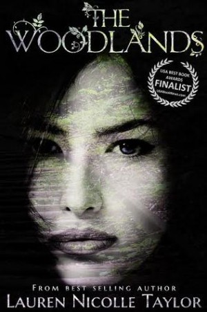
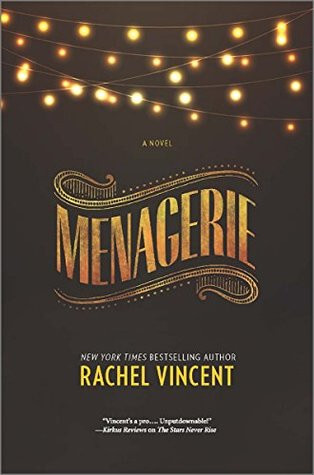
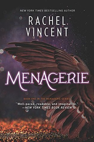
Okay, I don’t love the second one either. But which one evokes “mother and daughter survive in the woods”? The new one does! The old one evokes… menstruating birds, tbh, it’s all I can see.
Loading ...
So! Do you agree with me? Can you think of any I have left off the list? And, which do you think is the BEST glow up?
Discover more from It Starts at Midnight
Subscribe to get the latest posts sent to your email.


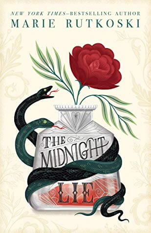
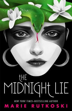


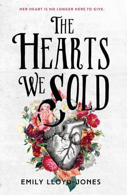


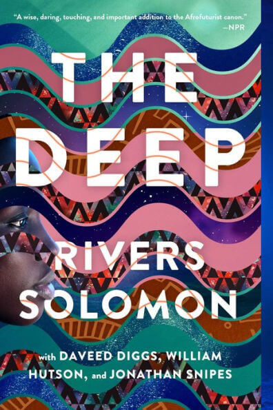


omg The Deep and The Hearts We Sold DEFINITELY had a glow-up ?? obsessed with the new ones! Although I have to admit I like the original Midnight Lie the best ? I was a bit sad they changed for that ?
AH I knew The Midnight Lie one would be divisive! I just love the colors of the new one too much! But like I said, the old one is still nice (and I do feel bad for everyone who had their covers switched mid-series, that is SO annoying!)
I was surprised by how many of the “before” covers I liked better. Hush was a toss up for me. Both are good (I think)
It just goes to show how different opinions can be- and why sometimes I think “my goodness who would MAKE such a cover?!” but realize that some people do love it!
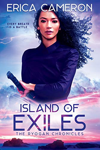
I like the ISLAND OF EXILES glow-up the best.
I really love that one too!
Okay, your menstruating birds comment made me totally laugh. And, yeah, now I can’t unsee it. That second cover is MILES better!
Bwhahahah sorry ?? I have no idea what it is trying to be but.. it isn’t working!
I only agreed with you on about 70% of these, which surprised me. But I’m coming to realize that I dislike straight photos of real people on covers (and I enjoy a mixed-media approach). Most of these I haven’t read, so I don’t know if the new or old cover better fits the story, but it’s pretty wild how the entire genre expectation of the book will shift with a cover change.
Some people REALLY disagreed with me! But I guess that is why there are multiple options for multiple tastes! You make a great point about how much the expectation of the thing shifts, it’s really true! I only read maybe half of these, so I have no idea if the new or old ones fit, I just like what I like ?
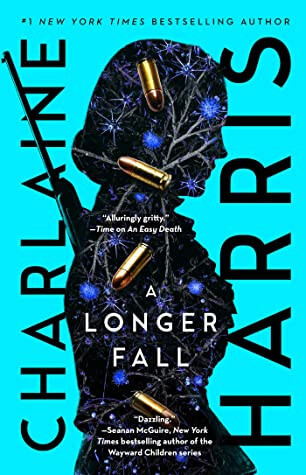
Like you, I love bright colors and I hate people kissing on covers. Actually, I hate people’s faces on covers. I know, I’m weird. But I LOVE this post. That was really fun to look through them and vote. Surprisingly, it was pretty even. I liked some of the afters better and some of the befores. The one that stood out the most to me was A Longer Fall. What a beautiful new cover!
Awww thank you so much!! I am not a huge fan of faces, but sometimes I can forgive them- I think it depends on how it is done, you know? Seriously, A Longer Fall was such an improvement!
This was so much fun! I love that you added in the voting system! Best glow up for me is Certain Dark Things! I’ve been eyeing that cover ever since I first saw it! ??????
This was fun! I love how the last two are just like YEA NOPE SECOND ONE FOR SURE.
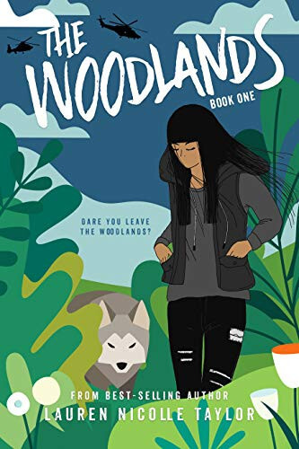
I love voting. Yes the Charlaine Harris- BIG improvement! The Woodlands- I picked the after cover, barely.
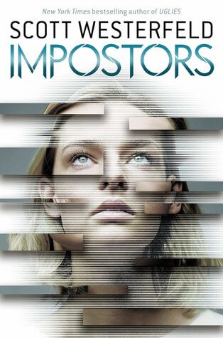
I guess I’m in the minority of Impostors though- I like the old one, something about that vague techie kinda look? 🙂
Ooh, Hush is tied!
And oh crap I’m one of the few that lies the earlier Menagerie cover! Eek. Same with The Deep. Looks like I’m in the minority on a few of these!
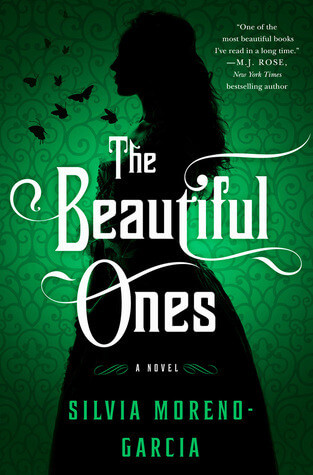
The beautiful Ones though- yeah that first one is awesome!
I love the old cover of Certain Dark Things and not just because it’s one of my favourite books ? The new cover is a little misleading because it’s a horror book about vampires, and the new cover makes it look like a cyberpunk novel.
Awesome post! There’s a lot of after covers that I like the best!
Fun! I really liked the first cover for Hush, but I kind of like the second one a bit more just because it looks like a Rorschach test and that has me immediately curious. haha
These are beautiful! I think I prefer most of the “afters.” I’m not a fan of photographs of humans on covers. The cover models rarely look like the characters in my head. Then I get distracted and wonder if the book designer actually read the book.
I love the original cover to Certain Dark Things and it really fits the story. But the new one is nice too.
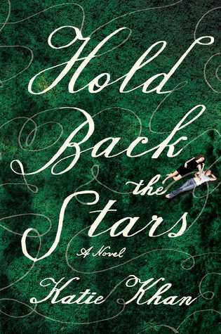
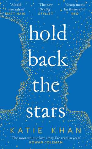
Hold Back the Stars is a huge improvement even if it’s blah lol
I have a love/hate with all these illustrated covers. I think they allow more accuracy but I just can’t tell books apart anymore.
Karen @For What It’s Worth
The new cover for Certain Dark Things is fantastic. Thanks for sharing!
Love these cover glow-ups! Some of my favorites are A Longer Fall, The Woodlands, and The Hearts We Sold.