
Ah, the dreaded cover change! Whether it’s a mid-series (those are notoriously the most evil) to a new paperback cover, they can make us squirm. I am not going rehash all the worst of the worst, because they’re pretty notorious (I mean, remember when they tried to change The Winner’s Curse? Those… were perfection, just why?!) Instead, I want to talk about the few, the underappreciated, the cover glow ups! Yes, these are those rare unicorns for which a change made things much much better.
Sometimes this happens before the book even comes out, but a lot of times it’s a switch when the paperback comes out, and there are even a few (gasp!) mid-series changes here! And… you get to vote on whether you think I am right!
(Just a note: These are all US editions, because it would get way too confusing to throw others into the mix!)
I mean, the before (HC) isn’t the
worst cover ever or anything. But the PB is
beyond fabulous and it’s what this book deserves, tbh.

Loading ...
The Before was an ARC cover that injured my eyes. The after was lovely. And well, there’s a third cover that is… problematic that we won’t speak of. This is the best one anyway.
Loading ...
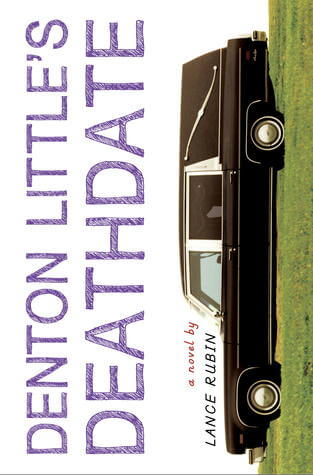
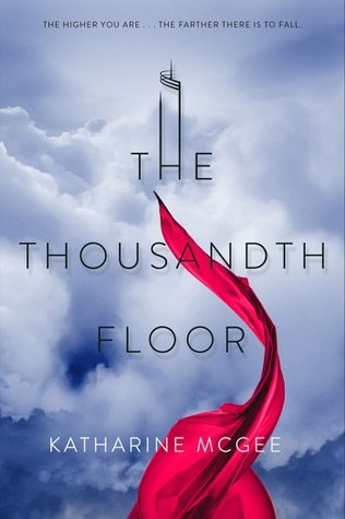
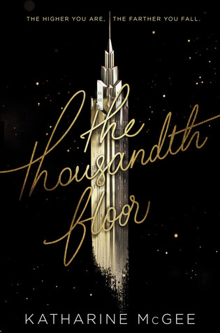
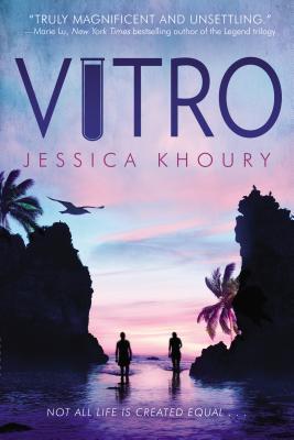
Oh look, the book that inspired this post! When I saw the cover for
the sequel, I was like “wow now
that is a glow-up” and here we are.
Loading ...
The Before was an early cover- I don’t even think it made it to ARCs? But while I actually kind of like it, the finished cover is
such a better choice and a full-blown glow up.
Loading ...
The Hardcover wasn’t terrible. It was decently creepy, if a little boring. But the paperback (and
sequel) cover? Oh come on, that is just… well it’s an actual thing of beauty. Horrific and creeptastic beauty.
Loading ...
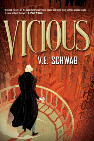
My goodness, I
loathe the original cover for
Vicious. It’s gross and there’s nothing you can say that will change my mind. And while there is a
new regular edition, it’s this special collector’s edition that has my heart. I
didn’t even love the book but I’d buy this just for the pretty.
Loading ...
Again, I must say that I don’t
hate the first one or anything. But holy wow the paperback is
incredible. Not only is it just more aesthetically pleasing, it fits much better with the entire tone of the book.
Loading ...
This is one of those covers that actually turned me off the book when I first saw it. Which is awful, but true.
Then,
Holly sent me this one, which literally came out
just in time for this post! And I
adore. It fits what I initially thought the book was about and I might actually buy it tbh, so… job well done, cover gods.
Loading ...
Ah, one of the OG glow-ups! Honestly, could they have actually done
worse than the original hardcover? I think not.
Loading ...
Okay this might be
the most dramatic glow up because… it’s legit “random girl’s armpit” versus adorably drawn f/f with best use of color
ever”. Not even a contest, sorry.
Loading ...
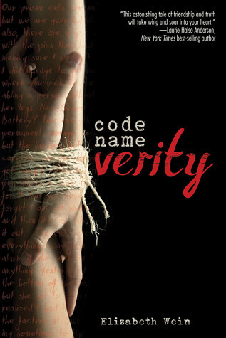
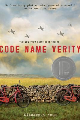
Okay I get that the dark and dismal vibe of the hardcover probably does work for a WWII espionage book? But screw it, if I am going to be depressed, let me look at the haunting and foreboding, yet pretty landscape. ?♀️
Loading ...
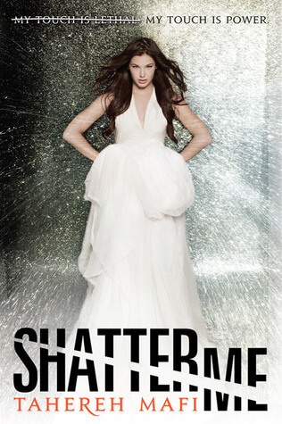
Okay look, I don’t
love the eyeball covers, but at least they use pretty colors and a decent font? The original hardcover is just… why is Juliette in a wedding photo shoot? No really,
why?!
Loading ...
So technically, this is a sequel, whose
predecessor also got the cover redo. But this one is much better so can we just go with it? These original hardcovers are so,
so bad. Not only do they feature girls looking forlorn (and maybe kind of in pain?), but why does her hand look wildly out of proportion? And also, there’s a weird coloring effect- like they’re going for vintage but failing? At least the redesigns have bright colors and a fun font.
Loading ...
Again, I do not hate the first one, nor do I love it. But the After… wow, I mean, I’m going to read it just to stare at the cover, basically.
Loading ...
So! Do you agree with me? Can you think of any I have left off the list? And, which do you think is the BEST glow up?
Discover more from It Starts at Midnight
Subscribe to get the latest posts sent to your email.


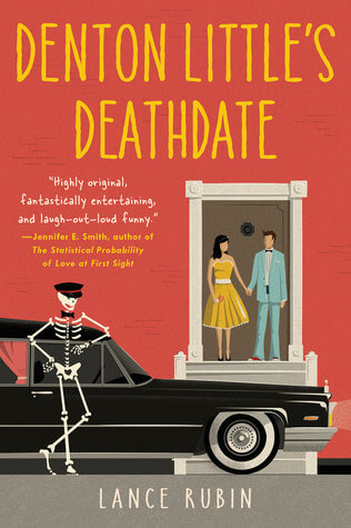


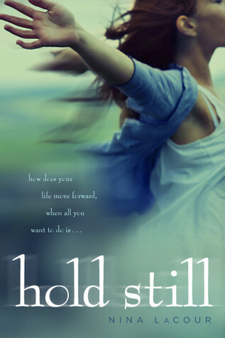


Fun post! Love a good vote and a good before/after. Hold Still was sucha good change and Denton Little too.
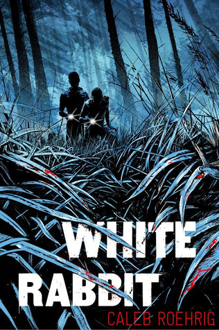
White Rabbit has a cover glow up already??
I haven’t clicked to see the Seafire sequel cover but I like the new direction!
Wow, so many glowups! I think that the Thousandth Floor changed the most — especially in a positive way. Thanks for sharing!
Krystianna @ Downright Dystopian
I love The Call paperback. That’s way more interesting than the hardcover. I also hate the original Vicious cover. That’s the one I own. I’ve considered donating it and buying a prettier one, but that seems like a waste of money.
The Ugly Stepsister by Sariah Wilson is a DEFINITE cover glow-up with the reboot.
Also, Susan Elizabeth Philips’ First Star I See Tonight – the original cover is just a big chandelier on a blue background (what??) and the new cover is a cute clinch cover. MUCH BETTER.
And not a glow up but the UK covers of all of Christina Henry’s books (Lost Boy, Alice, The Mermaid…) are SO MUCH BETTER than the US versions. Like so much better that I’ve got a post draft started about alternate covers, because I refuse to read these books with the US covers – that’s how much I hate them!! And I LOVE the UK covers!
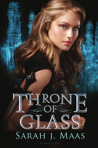
I agree with most of your choices above. But I have to chime in and say that the Throne of Glass cover is such a difference! Honestly, I received an ARC of that one with that original cover at BEA one year and all I thought was that it wasn’t my type, so I traded it away for something else. Later on, when I heard more about that story, I was so mad I’d traded it away, because then I wanted to read it! Fun post!
Seafire- wow that is a huge change. I don’t hate the earlier cover- I actually kinda like it- but that second one seems sooo much more adventuros. I seem to be the only one who like the “before” cover of The Thousandth Floor though, hmmm. I’m actually not crazy about either of those covers for The Call, but I voted for the second one because it’s definitely better than the first one! And Vicious- I’ve never liked that original cover, for whatever reason! The second one doesn’t wow me either, but I went with it.
Yikes, I’m in the minority on lots of these. White Rbbit I like the first cover a LOT more? Being in the woods, the blood thing… oh well. 🙂 And I love both Vitro covers, but that first one is one of my favorite. I love the blue w/ the white. 🙂
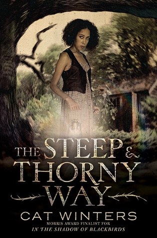
I like both Denton’s, but I actually liked the first Last Seen Leaving cover – or I should say – I dislike the second one more lol, The Steep and Thorny Way 2nd cover is so much better but I liked the original Code Verity.
Karen @ For What It’s Worth
I don’t normally love seeing people on the cover but I love the glow up that is Seafire! You also can’t beat the ToG upgrade.
I don’t like either of the “Thanks for the Trouble” covers. The first one is confusing, and the second one looks like a movie poster, which I hate. Same with Vitro. White Rabbit’s original is more interesting to me, but all the others–SHEESH did they improve. I actually started Throne of Glass twice because my library had both covers, and I didn’t realize I’d already tried that book. I DNF’ed in the first time, and when I started it with a new cover, I still didn’t like it, but also thought, “Wow, this story is JUST LIKE another one I read last year!”
I love, love, love your cover analysis posts!
I like the art style of the after cover of Seafire, but what bothers me is the way the character’s arm is positioned on the rope. It looks like it is bizarrely wrapped around, like it’s very contorted and there’s no way she could be grabbing it like that and not be twisting her elbow out of its socket.
Awesome picks up there. For the most part, the redesigns won me, but there were a few (Vitro especially), where I liked the original better.
I actually have a signed copy of Vicious with the original cover . . . that I still need to read. All the shame. I think the new designs are okay, but the original does give me more of a an old school superhero vibe, for what that’s worth. But I love this new twist on your book covers posts! Not quite as much hysterical laughing as the bad covers posts, but still entertaining. 🙂
Fun post! I kind of like the first Code Name Verity cover, but both are good. And I really liked White Rabbit – the book and the cover isn’t bad but the new one is really really cool. I’m also a big fan of the new Vicious cover.
-Lauren
? I love this post! I voted after for most of the book glow ups (except for Seafire, I have a thing against people on covers of books). And funnily enough, my copy of Thanks for the Trouble has a completely different cover ?
Ahh I love this post idea SO much! I am such a huge fan of the new Nina Lacour book cover, it looks SO stunning. I also love the Shatter me covers a whole lot. It’s nice to highlight these great glow-ups, more often than not the book covers, when they change, end up being worse than before hahaha 🙂
I love this post! I really like the new Nina Lacour cover, too. Like you said, those colors were expertly used! I’m undecided on the Seafire cover. Another series that changed covers right in the middle was Nightshade by Andrea Cremer. I’m partial to the originals (since I have an ARC of the second book with it’s original image), and they changed everything before the second book released. I’m not opposed to the new covers, but now my books don’t match, haha. It’s a little frustrating.
Lindsi @ Do You Dog-ear? ?
I had never seen that cover of The Thousandth Floor– and I’m kind of glad?? Because no. The ones they ended up going with are perfection. Also, WHITE RABBIT looks a lot better in the simplistic red and blue. I don’t really love either HOLD STILL?? If I had to pick, I would go with the original hardcover which was a girl looking forlorn (LOL) and a ripped paper. I think it’s because they made HOLD STILL look like WE ARE OKAY in the drawn cover and there are like 10 years between those books.
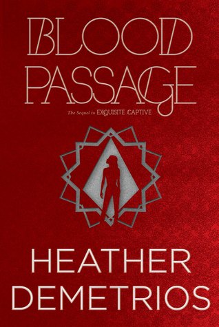
I agree with you on almost all of these, except I actually love the original Seafire cover, which is, ironically what inspired this post. The original Verity cover always made me think of some sort of kinky romance—I would NEVER get a WWII vibe from that. The after doesn’t really give me a good sense of what the book is either, but at least it doesn’t make my head go in a weird direction. I love both covers for Vitro, almost equally, though I did vote for After. And I’m not really a fan of either version of Blood Passage or White Rabbit, but the Afters are a bit better.
Everyone appreciates a good glow up and there are some stunning ones here. I especially love the new cover for the Nina LaCour book and I forgot about the original covers for both Throne of Glass and Shatter Me, they definitely got better.
Ooh! I love this topic! I have a personal preference for illustrated covers because stock footage just… doesn’t do it for me. I particularly enjoy the Anna and the French Kiss (series) glow-up. The smudged scenery! The same font! Someone earned their paycheck.
ok I am YES to most of these changes! I do like the White Rabbit and Seafire ones originally though. But otherwise, like who the heck was left alone to do Shatter Me and did they hate Tahereh Mafi that much to make THAT go through???? Smh.
Most times covers change for the worse, but these changes were perfect. I still prefer the before cover of Seafire, but the other ones were such a major improvement from the original (however, I quite liked both covers of Call). I don’t know who did the original cover of Hold Still, but it was so unappealing…
Happy readings! 😉
Tânia @MyLovelySecret
Super fun!! Love the idea of glow ups and I agree with most of yours. I did love the original vitro cover… but I used to be a graphic designer so I’m always going to go with the cover that looks designed. 😉
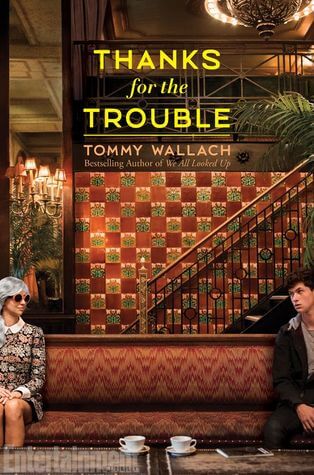
I actually liked the older Denton’s Little Death Date a whole lot more! But then some of the glow ups were totally needed like the Tommy Wallach one, and the Shatter Me and Throne of Glass ones. So I feel a mix. It’s rare I like the previous more but mostly I love the new ones 🙂
I love how you make interesting posts from something so simple, like cover changes! Really enjoyed this one. Especially the vote 🙂
And I agree about Vicious. I loathed that cover!! It’s.. so bad!! And actually doesn’t fit the book ONE BIT.