Hello there! Remember that time that I had no new ideas? Yeah, still don’t. But you know what I do have? The desire to look up weird/random/obnoxious/downright displeasing covers of popular books. This is, naturally, based on another post that I did. People liked that post though, so… why not go for round 2? The best part about all of this is that it really makes you wonder… did anyone involved even read these?! ?
Twilight by Stephenie Meyer


L-R: Movie Tie-In, Thai, UK, Russian
I won’t lie, I hate the Movie Tie-In just because they always skeeved me out together. The Thai one just… why’s she dead? My beef with the UK one is… look at her arms! The vampire didn’t get her, she freaking starved to death. It’s super unhealthy, especially since young girls are kind of the target. The Russian one is just plain creepy. And cheesy, let’s not forget cheesy.
Daughter of Smoke and Bone by Laini Taylor


L-R: French, Slovak, Czech
I feel like the French one went like this:
Person One: Doesn’t she have blue hair?
Person Two: Idk, we don’t have time for this.
Person One: But…
Person Two: Just tint the whole fucking thing.
As for the Slovakian one, why the actual hell did they need to take the badass female lead off the cover to throw some shirtless dude on it? I see what you did there, and I am not a fan. In the Czech version just.. why is she going to a lingerie party? I mean, I haven’t read the books, but I’m going to go out on a limb and assume this isn’t a thing.
The Perks of Being a Wallflower by Stephen Chbosky


L-R: US, Polish, Italian, and German
This US cover is why movie tie-ins became a thing, I am convinced of it. So boring I cannot even handle it. And then.. grandpa feet? Why? The Polish edition looks like the poster for an early 90’s After School Special. Also, thanks to the Italian cover, I learned that Perks is actually about two serial killers from the 1950s, so that’s a win. And hey, Germany. It’s called The Perks of Being a Wallflower, not Wallpaperflower.
Uglies by Scott Westerfeld


L-R, Top: Polish, Spanish, Portuguese (1)
L-R, Bottom: Chinese, Portuguese (2), Estonian
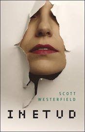
I do suppose it only makes sense that a book titled Uglies would have the most unfortunate covers. I tried to narrow it down but… did you see these? Yeah. I legitimately haven’t a clue what’s going on over in Poland, except I guess she has a bag over her head because she’s “ugly”? (Great message there, guys.) Only… I don’t totally hate it so maybe my taste is a mess. The Spanish cover designers were like “well, people like Hunger Games, right? Let’s just trick ’em!” The first Portuguese cover wouldn’t be so awful if there wasn’t a freaking eyeball sliced in half. I will have nightmares about the Chinese one until the end of days, no explanation necessary. The second Portuguese one… look, no one involved in this decision has read this book. I promise. As for the Estonian version, I don’t remember this happening, but I guess Tally just shoves her face through the wall on the regular, and we’re all going to have to live with it.
Thirteen Reasons Why by Jay Asher


L-R: Estonian, German, Italian, Vietnamese
I… am I missing something? This book is about goddamn suicide, right? I guess at least the Estonians don’t shit all over mental health, so they should probably win even though this looks like a twenty year old yeast infection cream ad. But Germany… really? This looks like a slasher film poster. As does Italy’s fore into this book’s cover design. And Vietnam is just skipping the horror flick and going straight for… porn, I think? ::Shakes head::
Shatter Me by Tahereh Mafi


L-R: Australian, French, Polish, Serbian
Why, Australia? Did you read the story? This isn’t a contemporary about a forlorn girl with banging hair. The French cover is confusing this with The Selection, basically. The Polish one looks painful, and I think they might have killed Juliette so who knows what happens in the sequels. As for the Serbian cover, they decided to use the same idea as the US redesign, but make it infinitely more horrifying by insinuating there was glass in someone’s freaking eyeball. Thanks for the nightmares.
Blood Red Road by Moira Young


L-R: UK, Swedish, Russian, Bulgarian
I guess the UK one isn’t awful, but it doesn’t fit the tone of the book at all. Plus, you know if I’d seen that damn bird I’d never have read this series and I loved this series. I just don’t understand what is happening in the Swedish one. Well- I do, I guess, because it kind of fits the story but it’s still scary and ugly so whatever. Also, because I am clearly a child, I am laughing that it says “Vag”. Ahhh the Russian cover. They didn’t want to fully copy The Hunger Games or Divergent, so they decided they’d just mash the two up and slap the title on the cover. NOW no one can accuse them of copyright violation ::insert evil laughter coming from two Russians who gave zero fucks about this cover:: And the Bulgarian cover commits two sins: It’s boring, and there’s a scary ass bird. Fail.
And Some Gorgeous Surprises!
Look at me being all positive! I didn’t want to just shit all over covers, so here, have some pretty ones that I stumbled upon in my search!


L-R, Top: If I Stay (German), Blood Red Road (Indonesian), The Perks of Being a Wallflower (Japanese), Shatter Me (Spanish)
L-R, Bottom: Shatter Me (German), Twilight (Indonesian), Daughter of Smoke and Bone (Portuguese)
I was going to include If I Stay, but there weren’t enough strange covers- and I loved this one too much not to share! I love the badass Juliettes! And how did Indonesian pubs manage to make freaking Twilight look fierce?! I love it! I need all of these, please and thanks.


The UK Twilight is… horrible. And yeah the dude Smoke and Bone cover- where’s the girl? I had to laugh at “just tint the whole fucking thing” lol. I kinda like the Czech one tho? Sort of. All the Perks covers are shit. Ugh every single one is ugly. I voted for that awful Italian one as the worst.
A bag on her head? Seriously?? Click. Ooh 13 Reasons- yeah the Estonian team could put together a Vagisil proposal? That Italian one though- damn. Click. As for Shatter Me, I *kinda* like the Polish and Serbian versions. They’re kinda edgy. I like the Swedish version of Blood Red the least. Click
the German Shatter Me is nice, and so is the German If You Stay
Bwhaha right? I mean it clearly says DAUGHTER of Smoke and Bone FFS. I don’t *hate* the Czech one, but it looks… unprofessional almost? Like some kid slapped it together with Paint hah. The Perks covers ARE gross. I voted for the Polish one because the font made my eyes want to bleed. But in the Italian one all the characters are mass murderers, so I see your point. The Shatter Me covers are the best of the bunch but that Serbian one makes me cringe because EYES. But I still voted for the Aussie one as the worst because ew. The Germans definitely redeemed themselves with those two nice covers, they’re my favorites too!
Hahha! This was great! I’ve always hated the Us Perks of Being a Wallflower. I don’t understand it at all. It’s just straight up ugly. Why is the photo just in the top right corner? Why is it that ugly green? I don’t get. It looks like an unfortunate formatting error that they couldn’t be bothered fixing. Although, that Japanese cover is absolutely gorgeous.
Aw thanks! And seriously WHY was it so boring? And just… not pleasing to the eye? I get that they want to show that the guy is a “wallflower” but there must be better options! And YES- it’s like a green screen that they forgot to remove bwahah. I agree, LOVE the Japanese one!
omg, shannon, this is hilarious! i think the prettiest cover is the german shatter me cover. the ugliest cover i’ve EVER seen is definitely the uk cover of my lady jane by cynthia hand, brodi ashton, and jodi meadows—girl, you would not believe! i have never seen so many design and marketing missteps made in one cover before (or frankly after) i saw that one! i highly suggest you take a look at it if you want a good laugh!
The Uglies certainly lived up to its name. All the covers were quite unfortunate.
Omg I’m laughing SO HARD at your commentaries. ?? And like literally that Blood Red Road one with the MOCKINGJAY on the cover??!??!?! Wtf Russia.? I mean way to go for plagiarism. I guess being a designer is tough?
And I’m embarrassed for my own country regarding the Shatter Me series. It’s so so bad. I own Ignite Me in that edition and I just try not to look at it.
I honestly can’t believe the Russian designers managed to get away with the Blood Red Road cover. =| And wow, the Indonesian Twilight… I want that! Maybe the story is also somehow better in Indonesian?
Oh you had me laughing with all of these. They are sooo bad!! Really what were they all thinking with those covers. Thanks for sharing all the ugly 🙂
I actually like the US cover of Perks. It’s eye-catching, and kind of symbolic. The person is all the way on the edge, like a “wallflower,” but is surrounded by overwhelming brightness.
The rest of these are pretty bad, though. XD
I’m laughing so hard right now. These are terrible. What is wrong with book designers? Do these covers actually get people to buy the books?
The chinese cover for Uglies By Scott Westerfeld will give me nightmares! I strangely like the polish cover for Shatter Me by Tahereh Mafi C:
Oh my gosh, I’m LMAO right now! This post was everything. I’m tearing up now. Wow, **shakes head**. Nope, these guys really have it very wrong. Thin AF Twilight looked really bad, and that yellow color for the US version of Perks of Being a Wallflower burns my eyes. The one that made me laugh the most was the German “Perks of Being a Wallpaperflower”, but the MOST ATROCIOUS cover for me was Porn 13 Reasons Why. That’s just disrespectful.
I LOVE how creative the designers were when they came up with the idea of copying The Hunger Games AND Divergent into one! **Clap Clap** Idea of the Century.
And I’m so sorry but I don’t like either of the Pretty Covers. Except for Daughter of Smoke and Bone because that one is pretty badass.
WONDERFUL post, Shannon. I’m in such a good mood now! LOL.
Ahh I love this series! It makes me laughing so hard! I don’t understand how Shatter Me can have so many awful international editions while the US one is so damn pretty. Have you seen the Indonesian edition? They are really bad (shudders). Indonesian Twilight is definitely one of the prettiest editions though, I guess they were one of the lucky ones in design department! 😀
OMG these are so bad, especially the Daughter of Smoke and Bone ones and the Thirteen Reasons Why covers. Just…who designed them and thought they looked good? I absolutely love the pretty Twilight cover and the German Shatter me edition, though. Those are beautiful.
Oh my gosh, your comments are pure gold. I don’t even know how to feel about some of these–the only possible explanation I can come up with is that these designers get like one sentence about the book and then just take their own liberties for the rest?? And that Blood Red Road mash-up of The Hunger Games and Divergent completely cracks me up. At least I can see where they were going with that one! The Vietnamese Thirteen Reasons Why and French Daughter of Smoke and Bone are both exceptionally bad. I love these posts!
It’s funny how so many of these covers look objectively objectionable, in the sense that I think they’d be summarily mocked in the US market (as you have done ^^). Although, there are a number that don’t seem too bad, design-wise, but if, as you said, they’re totally different from the story . . . it just seems strange to me. I’d really love to know how marketing departments designing new covers for translated books make those decisions. Great post once again, Shannon!
I can’t even pick which one is the worst because they are ALL that bad Shannon. Well most of them at least. But yes they are fun to look at and to make fun of. I feel bad for all these books but at the same time I do not 😀
I love when you do these. Please never stop. It’s endlessly entertaining AND makes me think I could get any easy job as a book cover designer basically anywhere outside the US.
I love this post Shannon. Please do more soon. PS the worst is the UK Twilight. It freaks me out that Bella could slip under doors!
That UK cover of Twilight is horrendous. It makes me wonder what goes on in their head while designing. Let’s just make her head twice the size of her body. And oh, let’s make her arm the size of a straw. Perfect. I really like the Portuguese cover for Daughter of Smoke and Bone!
Oh wow, there are some pretty horrendous covers here! Thankfully I don’t remember ever seeing that horrible UK version of Twilight anywhere in stores, I just remember the usual black one with the flower on it. I really don’t know what they were thinking with that one! 🙂
Some of those covers are pretty bad! Great post 🙂
I did like the Swedish cover for Dustlands, but I can’t say how it fits the book because I haven’t read it.
Wow these covers are truly bad. The covers for Thirteen Reasons get to me especially since I just read the book last night. That Vietnam one is absurd and makes no sense for the novel. Anyone that picks up the book based on that cover is in for a rude surprise! I think the UK Twilight is one of the worst covers of all though, what is with that art and such a scary skinny character!?
Yeah, there are some really crazy covers here! LOL I actually like the U.S. one for The Perks of Being a Wallflower – the old man pants thing makes sense if you read the book. 😉
-Lauren
Oh my gosh, the french edition of Daughter of Smoke and Bone is awful ! How can they expect to sell it with that ? ><
"Just tint the whole thing" it's so true haha
There are so many unfortunate covers, who knew there were so many out there in the world? There is something so nice about an ugly cover, isn’t there? Especially when it’s for a really popular book. I don’t know if I could choose anyone as the most unfortunate, though. I suppose the covers fitted to the target market in the country they’re for but who knows.
Okay, I seriously think I might have some issues because I actually kind of love all the Shatter Me covers. I haven’t read the book, though, but I would pick it up based on these weird covers.
What a ton of fun these are! Though I’ve always actually liked the Perks of being a Wallflower cover, because it is iconic–I get a glimpse of that color and I know what book it is immediately. I also like the Chinese Uglies cover. But oh dear God the rest are all kinds of awful.
Great topic! I agree with you on a lot of these covers they don’t really match the book and some of them just are awful.
This makse me happy in the most cringe–worthy way! That German cover to 13 Reasons Why is SOO misleading.
That U.K. Version of Twilight. OMG who gave that the green light? Forget the emancipated arms… what the hell is wrong with her head? That one just weirdos me out. Still howling over the Italian Perks cover. “Two serial killers from the 1950’s.” Bahahaha! Yes! Because that’s exactly what it looks like. That freaking Chinese cover for Uglies is the stuff of nightmares. Apparently the Italian publisher thought 13 Reasons Why was about a goth vampire.
There’s so many terrible covers in this I had no idea what to even vote for a good chunk of the time? Like… that cover of the U.K. version of Twilight kind of made me want to light myself on fire. Which is awkward on many levels. I’m still cracking up on the cover for Blood Red Road’s Russian edition. Oh my God, who let them do that??
The hashtag AWKWARD game would be strong for these. Thank goodness these aren’t the covers we have to buy for these – because inside these “fail” covers are some great stories! Or I’m sure there are – TBH, I don’t think I’ve read any of these. 😉
Fun post, Shannon!
Yaaaas I was hoping you would do another one of these. The different covers are hilarious. What even is up with the Twilight ones? That’s the UK cover??? Was it a “special” edition?? The heck. And the French cover for Daughter of Smoke and Bones hahaha. I love your idea of how it went down. It looks like she’s at a rave. The US version of Perks looks similar to a German publisher who always publishes classics in that really boring format – why? Yes, let’s encourage people to read LESS classics, it’s not like they have a reputation of being boring already. Uglies has so many great creative covers, but these… are not them. I had a hard time picking the “winner”. The Vietnamese version of 13 reasons looks like a cutesy book about someone trying to find love. I don’t hate the Shatter Me covers, but the Russian cover for Blood Red Road annoys me to no end – do they think no one will notice?
So many unfortunate covers in one post… it hurts my eyes. I pretty much agree with everything you say in this post, especially about the porn cover of 13 Reasons Why. Love your reasoning behind the French DoSaB, I can totally see that conversation happening with that cover.
Amazing post!
~Brittany @ Brittany’s Book Rambles
I love this post and feature 😀 why does everyone think the UK cover is the worst? Clearly the Russian one looks like it’s been badly done with MS Paint or something 😀 it looks like one of those self-help books by some cheap guru 😀 it’s hilarious 😀 I have to say, I didn’t notice the arms before you said that! But still, it’s the Russian that’s the winner for me 😀
The shirtless dude is also completely crazy 😀
I think the Perks look like that in the movie tie-in because it’s probably part of a series, I mean not series, but like… When they have a collection of like 20th century authors for example, and all the books are some shade of color and a picture at the top. That’s my guess. I am really bad with words today (party yesterday…) so I hope you get what I mean 😀
Now these polls are just telling me that I am soooo in the minority when it comes to book cover aesthetics. LOL
Okay and WTF is that Uglies Polish cover? 😀 What is that even?? Is that a bag? What is that even xD and why does the Portuguese cover look like the cover of some geisha book? :DDD you are cracking me up with these. Except I feel that the Estonian one is kind of cool?
13 Reasons Why Estonian :DDDDDD omg what 😀 The German name also says “Dead Girls Don’t Lie” (???) The Viet one though. I don’t even… know what to say 😀
OMG Blood Red Road.. Again with the Hunger Games?? I think the Swedish one is kind of okay, at least they read the book, right? The broken earth, the heart stone? It’s not so bad. At least it’s the est of thenm all!
Those good one though… Blood Red Road is just perfect!
Please please PLEASE make MOAR of these posts! I am addicted!!
There are so many unfortunate covers in just this post and sadly two of them are from my country, Portugal. But at least our cover of “Daughter of Smoke and Bone” does look badass (pardon my language). It seems most publishers do not read a book before creating a cover. Those covers of “Thirteen Reasons Why” are just too unfortunate. As you said, one seems to be promoting a slash book and other a porn one. Also, the UK cover of Twilight not only seems to promote anorexia, but it also is very confusing. Publishers should be more careful with their decisions.
Ps. I need to Indonesian translation of “Blood Red Road”. It’s so beautiful. And, I can’t resist a pretty cover. I think I’ll have to learn Indonesian so that I can have a reason to buy it. =P
Loved this post. I hope you do more of these. Happy readings!
a href=”http://mylovelysecret.blogspot.pt/”>Tânia @MyLovelySecret
Oh my goodness, I’m so unsettled by the arm on that UK Twilight cover. And you’re right, that’s sending a terrible message to young girls. Honestly though, I think the original US version of Uglies is even worse than all the ones you have here. Like, I have those, and they’re all just awkward close-ups of faces with awkward placement/cropping. I think the Chinese one represents the book well though! I think the worst is the one that looks like Hunger Games because they didn’t even try! The Russian Blood Red Road one is killing me because you’re right, they just mashed up the two most popular covers they could think of. Oh wow, yeah, the German and Italian 13 Reasons Why covers look like straight-up horror. I like that Serbian cover of Shatter Me though!
Omg some of those covers are horrible. The Uglies one with the bag on her head? And I’m a big cover whore so these matter! Thanks for letting us vote – I was surprised at the results!!