Top Ten Tuesday is a feature hosted by The Broke and the Bookish. This week’s theme is: In honor of 5 years of Top Ten Tuesday ( our first Top Ten Tuesday debuted June 21, 2010) — My Ten Favorite Top Ten Topics We’ve Ever Done In The Past 5 Years
Well, as usual, I am not following the rules. And here’s why: I apparently didn’t even read the rules correctly when I first saw the prompt and thought I was just supposed to do my favorite topic. So, I started that! But um, that wasn’t it at all. Sorry(ish). Anyway, I found the topic Covers I Wish I Could Redesign and Favorite Covers, so I figured I could basically do from one end of the cover spectrum (the bad) to the other end (the really amazingingly beautiful). The problem, especially with the prettiest, will be keeping myself in line.
The twist I am using to keep the numbers down? The books have to be 2015 books. Boom. I also kept it to YA, because honestly, we could find cheesy romance covers until the end of time.
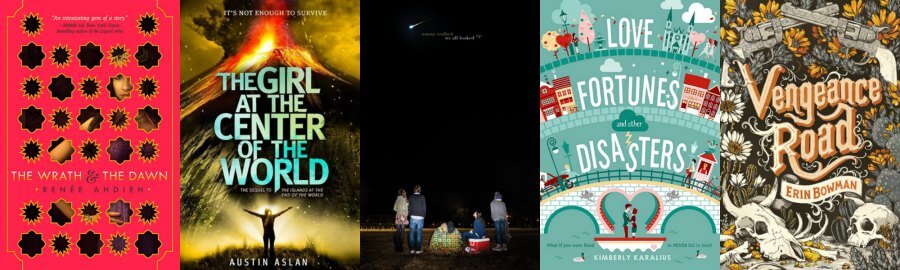
The Not Great (But they may be WONDERFUL books- don’t judge a book by its cover and all that fun stuff!)
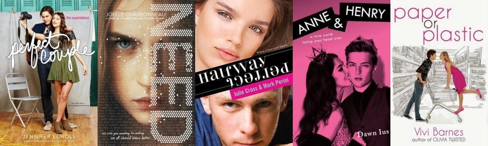
- Perfect Couple by Jennifer Echols: Seriously, the cheese factor is so through the roof I don’t know how to function. I was in high school and whatever this is isn’t a “thing”.
- Need by Joelle Charbonneau: Girl, you need to stop being so creepy. I also dislike half-faces and the font has got to go.
- Halfway Perfect by Julie Cross & Mark Perini: I have heard from Nori that this book is fabulous, and it may be! But the cover just is not. I can’t read it, and that dude kind of looks like he wants to steal my soul, so there’s that.
- Anne & Henry by Dawn Ius: Nope. Why is she biting his face? This isn’t about vampires, is it? And please try to tell me that he does not look like the douchiest guy in all the land. I dare you.
- Paper or Plastic by Vivi Barnes: I don’t need to explain myself here, do I? What even is this?
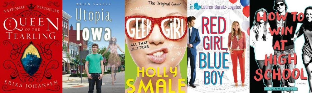
- Queen of the Tearling by Erika Johansen: Look, this book isn’t 2015, but this cover is, and it is bad. Seriously, can someone please bring the pretty black one back? Whoever did this must hate books and eyes and stuff.
- Utopia, Iowa by Brian Yansky: I am sure that Iowa isn’t great, but it has to be better than this. Has to.
- All That Glitters by Holly Smale: I want to smack this girl, which is kind of violent, but seriously, what is she doing? Make her stop. This one actually made me ragey.
- Red Girl, Blue Boy by Lauren Baratz-Logsted: Okay, none of these covers are great, but this one has to be the worst. The cheesy colors, the weird looks… pass.
- How to Win at High School by Owen Matthews: If this is winning, I’d rather be losing.
The Pretties that Make My Eyes Happy
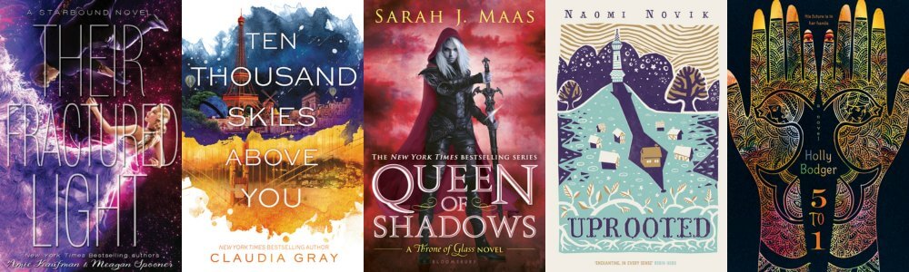
- Their Fractured Light by Amie Kaufman & Meagan Spooner: I still like These Broken Stars the best, but this is a very close second.
- Ten Thousand Skies Above You by Claudia Gray: Is it terrible if I buy this just to stare at it? I will read it, but… mostly stare at it.
- Queen of Shadows by Sarah J. Maas: It’s pink. It’s Celaena. Who even cares about anything else?
- Uprooted by Naomi Novik: I need the UK version of this STAT. Please and thank you.
- 5 to 1 by Holly Bodger: It’s unique and full of culture. Such a freaking win!
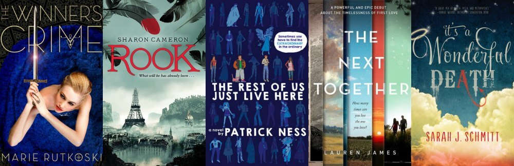
- The Winner’s Crime by Marie Rutkoski: Because no one does dresses like Kestrel. Also, swords.
- Rook by Sharon Cameron: Um, it’s sunken Paris. Do you need further explanation?
- The Rest of Us Just Live Here by Patrick Ness: It’s going to glow in the dark. And I have magnets to match!
- The Next Together by Lauren James: This is just pretty, and crazy-unique. The colors make me happy.
- It’s a Wonderful Death by Sarah J. Schmitt: Seriously, this is the cutest damn cover ever. The clouds, the font, the blue! Also, I love the synopsis, but that’s a different post.
The Runner-Ups (Because I can never choose 10!)

I’m going to have to do the cover redesign topic at some point. Great choices! 🙂
Check out my TTT.
Thanks so much! I look forward to yours!
I mentioned both of these topics and said I hope we do them again so I can take part! Love that you’re beating your own drum! You picked a lot of great bad covers! And YES…what happened to Tearling!? And for pretties, again, yeees! Claudia Gray and Holly Badger are my favorites. Love the UK Novik, too! OMG, love when you open up THE WRATH AND THE DAWN! I was even more excited for VENGEANCE ROAD after that cover! Great choices!!
Aw thank you!! And seriously, WHY would they do that to such a pretty cover! YESSS! It is the INSIDE of Wrath that makes it so freaking gorgeous, but it wouldn’t work without the outside, so, honorable mention 😉 Vengeance Road’s cover is perfection. I cannot WAIT to read it!
Ooh I love this topic. There are some shockingly bad covers out there but some beauties as well <3
Thanks! I agree- had I not just stuck to this year… well, it could have gotten insane 😉
Wonderful list, glad there are covers, it brings the post more to life!
Aw thanks so much!
So many beautiful covers!!! They make my eyes happy too, thanks 😀
Aw thanks 🙂
Those are definitely some not-great covers at the top. I know people who get paid to make beautiful covers, why aren’t they used as often as they should be? All the work that went into a book, and then a crappy cover gets slapped onto it? That’s insulting. As for the pretty covers…yes, they are SO pretty. The only one I don’t like (and wish I could redesign) is the cover of We All Looked Up. You can’t even see the title since it’s so tiny. When I was making a display at work, I had to take it off because it looked like a giant black hole. It literally looked like a black hole where a book used to be but was sucked out of existence. Maybe if the title was bigger or if it was written in falling stars or something. Great list (you rebel, you!)!
Michelle @ Michelle’s Minions
Here’s a funny “did you know?”: The cover of We All Looked Up wasn’t supposed to have a title at ALL. It was just supposed to be the picture. But apparently, there was some kind of rule within the publishing house somewhere that they HAD to put the cover on it. So they did it as small and unobtrusive as possible, so that’s the backstory! I loved it when it had NO title.
I seriously want to know what goes through the minds of the bad cover design team- not JUST the designer, but ALL the people in the process!
Hahah and thanks- I know, I really need to pay attention to what I am supposed to do 😉
Great list!! There were way too many topics from the past five years to choose from for my post!! I had a difficult time narrowing down which ones made my TTT post for this week.
Here’s a link to my TTT post for this week: http://captivatedreader.blogspot.com/2015/06/top-ten-tuesday-my-ten-favorite-top-ten.html
Thanks 🙂
OMG THOSE COVERS. They ARE so pretty. A bit surprised to see Queen of Shadows there (even though it well deserves it) because ToG’s cover was so awkward … it is WAY prettier now, though. On the flip side, WHAT IS THAT TEARLING COVER. I saw a copy once a year or so ago and it was so pretty though :S And I actually saw someone recreate the pattern of 5 to 1 on their own arms with henna, complete with a tutorial online! SUPER COOL.
I still think Heir of Fire’s cover is the best one. BUT, QoS is pretty too- it also has me wondering because her hair is different!
And SERIOUSLY- who would take the gorgeous Tearling cover and make… that red mess?! NOOO. And I agree, 5 to 1 is just fabulous, I want to see this recreation, off to google!
PSST. I found the link, so here goes: https://weavingwaveswords.wordpress.com/2015/06/06/how-to-recreate-a-book-cover-a-handy-tutorial/ SUPER COOL.
OMG! This is FABULOUS!! Thank you so much for sharing it!
Also- TWO HOURS of not using your hands!? I don’t think I’d last 😉
Love this post!! Uprooted (UK version) is definitely one of my favourite covers from 2015 – it’s even more gorgeous in real life!
GAH, Rhoda, you’re killing me, I am barely resisting purchasing it as it is 😉 I have no willpower! And thanks!
You had fun with this prompt, even if it wasn’t exactly the one posted!
Here’s my Top Ten Top Tens!
Bwhaha true story! 😉
Umm….I kind of love the Anne & Henry cover. The rest of the not great I totally agree with. I love covers so much – Their Fractured Light, Ten Thousand Skies Above You, The Next Together and Love, Fortunes and Other Disasters are my faves from your list.
Hahah well, I knew my choices wouldn’t be universally popular 😉 I HATE the cover- that guy… I want to smack hiM! I am a huge sucker for covers too 😀
Hehe… is it weird that I totally LOVE that you chose your own topic this week?! 🙂 And a COVER topic?! Those are my all-time favorites!!! (Yes, I’m totally, absolutely, 100% obsessed with books covers. I would frame them all as artwork if I had more wall space in my home. Seriously.) So this post is like my favorite post ever!! <3 I love the covers you chose. Though some of the ones you're not really a fan of I find pretty cute (like Anne & Henry… not sure why, but I think it's adorable) I totally agree with most of your picks. And the ones you love – SO GORG!!! Especially Uprooted. I've never seen this cover before, but I'm officially in love. GREAT POST!! 🙂
AWW thanks! I agree, I am obsessed too, and I feel like I never have anything particularly unique to ADD about covers, so I don’t do a lot of posts on them so… I had to! I would frame them too! I wish posters were more of a “thing”- like posters of just the covers!
A lot of people agree with you on Anne & Henry it seems. I don’t hate the whole cover, I just hate the look on Henry’s face and WHY is Anne biting him!?! WHY!?
And it is taking every ounce of willpower I have NOT to buy the UK Uprooted. EVERY. OUNCE. 😉
Nice topic, you rebel, you. 🙂 Glad to see you added Paper or Plastic because, seriously, how could you not? I’ve heard that it’s actually a cute story but… sorrynotsorry, I just can’t. And that Anne & Henry? Who the hell green-lighted that monstrosity? I’ve never seen it before and wish I hadn’t seen it now. My eyes…
Rutkoski and Maas must have sold their souls to the devil to continually have the most kick ass covers ever. So. Much. Pretty.
Bwhaha thanks! And seriously, what is WITH that cover?! It’s a fake grocery store? With two real people pasted in looking dorky?! NO. And YESSS thank you, finally someone who agrees with me about Anne & Henry! I cannot.
I agree- those covers. Like, just whoever does their covers should be some kind of superstar, because holy gorgeous. EVERY. TIME.
I’ve actually read Perfect Couple and liked it, and I kinda want to read Anne & Henry because of the cover. For some reason I think it’s super cute! I love the covers of Ten Thousand Skies Above You, 5 to 1, Their Fractured Light & another book that didn’t make the list is The Start of Me and You by Emery Lord.
Ah, almost everyone disagrees with me about Anne & Henry. Unpopular Opinion, I suppose! And the book itself is probably really good, the covers just get me a little stabby 😉
Ohhh that IS a pretty one, good call!
Queen of Shadows is a beauty:)Their Fractured Light is also beautiful! So pretty and not so pretty covers:)
Thanks so much 😀 I agree!
I like that you didn’t stick to the rules 😉 This is the first time I have seen the The Next Together cover and I absolutely love it, it looks so good. I ADORE the Queen of Shadows cover, it’s so beautiful!!! Definitely agree with the ones you put on your not so great list, they’re all really bad. Here’s my TTT if you want to check it out 🙂
Aw thanks! I agree, and I think it fits SO well with the synopsis- that’s one I cannot WAIT for! As is Queen of Shadows, of course 😉
The cover for Their Fractured Light is so pretty! I have to agree with you that These Broken Stars is till my favourite, but this is a close second. That series by Cluadia Gray doesn’t sound like a series for me, but I am almost tempted to just buy them for the pretty covers. I hand’t seen this one yet, it’s just as pretty as the cover for the first book!
And that cover for Need is pretty horrible, that girl just looks creepy. And that Geek Girl is really horrible too, I just wish she would wipe that weird expression of her face. What’s up with that?
Great lists! I love looking at covers, some are really pretty, others are just weird and some are really bad.
I don’t think any cover ever will be prettier than These Broken Stars! It’s like the cover gods smiled upon them 😉 And A Thousand Pieces of You was only okay, but I will still read the sequel.. mostly for the cover 😉
And I agree- Need is scary! And Geek Girl, I cannot. It makes me so rageY! And thanks- I love looking at/talking about covers too 😀
Of course you would be mistaken and start doing a totally different post hahahha. JUST KIDDING I STILL LOVE YOU. I know the Queen of Tearling has another cover, I’m pretty sure. AND THE COVER OF THEIR FRACTURED LIGHT IS SO PRETTY.
Right? This is so NOT surprising. Yes, Queen of Tearling DOES have another cover. A better one. That’s my point- WHY would they make this ugly, awful one?!
Oh you are such a rebel! Ha. Some of those covers are beautiful. Not the one for Perfect Couple. Yeah, totally cheesy. I think I avoided that book specifically because of the cover. I love the cover for Ten Thousand Skies Above You. And that reminds me that I STILL haven’t read that one. One of these days . . . maybe . . .
Hahha thanks! A Thousand Pieces of You was okay. Not as good as it could have been. I still plan to give Ten Thousand Skies a chance though!
Hey! I actually liked the cover for Anne & Henry. I totally agree with the rest of your list bad list. I always judge a book by it’s cover, so I haven’t read any from your dislike list. I think 5 to 1 and Uprooted have pretty bad covers, but that is just me.
Most people agree with you, apparently! I am the black sheep on that one. BAHHHH. Do you like the US Uprooted cover? It’s quite different!
It always amazes me the differences between the US and UK covers, The cover for the Queen of the Tearling is so totally different over here and as you show Uprooted which is beautiful too is completely different in the States. Lots of nice covers but you are right some are just plain off putting!
Great post!
Oh, Queen of the Tearling is MUCH nicer here in hardcover, but this new paperback monstrosity is just… yuck! And I really LOVE your Uprooted cover- so gorgeous! I kind of love the differences, because then I can decide which one is prettier and buy that one 😉
*checks TTT list* *squints* Shannon, I think you’ve got the wrong topic. 😉
LOL I kid. You’re such a rebel doing this (*cue ooohs from the blogosphere*), but I love it!
It sometimes gets a little repetitive reading the same topic over and over again on everyone’s TTT posts, so it’s nice to get some variety in here and there, so thank you!
But, anyway, I completely agree with everything you’ve said here. There are so many beautiful covers out there and you’ve listed some great ones. Thank you for sharing and fabulous post! ♥
Bwhahah right!? Absolutely the wrong topic. But that’s kind of what I figured, that this week would be REALLY repetitive, so I just kind of went with it 😉 And thanks, I am glad you enjoyed it!
Ahhh cover loveeeee!! Queen of Shadows makes me SO excited. It’s so freaking epic. The Winner’s Crime is beautiful, and I love the mystery and elusiveness of the Wrath and the Dawn. Vengeance Road is such a pretty cover too, it really captures all that the book seems to be about. 😀
I know, it is GORGEOUS! I am going to *try* to finish Heir of Fire tonight. We’ll see, I have like, 150 pages soooo… it’ll be close 😉 And The Winner’s Crime makes me SO happy. Happier than The Winner’s Kiss. Maybe someone can fix that one? And yep- totally agree with Wrath and VR- they both epitomize the plots! The inside of Wrath is just… GAH, breathtaking!
I am almost never a fan of faces on covers – especially when they are just very large heads. I don’t get the point.
I love the Starbound trilogy covers! They are some of my favorite. For The Winner’s Crime I wish they had kept the titling like it is on the ARC (to match The Winner’s Curse).
Totally agree! JUST faces creep me out. Why are they looking at me!?!? I agree about TWC- but the worst for me is the dress on TWK- it is red and it CLASHES. You cannot have that mauve color, then blue, then red. They don’t go! (Sorry, strange rant over 😀 )
Even though you went rebel on us, I LOVE what you did! Especially the pretty covers 🙂
Awww thank you 😀
I hope the girls choose this as a future topic, it’s a great one. So many people are featuring TTT that were about book covers, we all tend to choose our books that way initially. It would be fun to talk about redesigning them.
Thanks so much! I think seriously getting into the actual redesign would be so fun! Like, specifically how we’d make it better! May make for a good discussion topic one of these days 😉
Yessss yesss. OMG I AM IN LOVE WITH ALL THE PRETTY ONES. Particularly This Fractured Light. Like I love ALL that trilogies covers. I can’t even pick. I love the first one because it sucked me in, and her dress, aldfjsak. But I love book 2 because it’s so kickass. AND I LOVE THREE BECAUSE THE COLOURS CALL TO ME. *hyperventilates* But all the pretty covers. Yes and yes.
Also I approve of your rule-breaking here. MWAHHAHA. Rebel.
And this: “Whoever did this must hate books and eyes and stuff.” <– ME to every dodgy cover ever.
RIght!? How do they NOT have a bad cover in the bunch? They must be paying the cover gods handsomely. I agree, the DRESS in #1. And the STARS. I just… love.
I had a feeling you’d approve of my rabble-rousing ways 😉
The first ten covers- OMG, they’re so hilarious! Don’t they ever think twice before letting these covers out?
*Looks at the Anne and Henry cover – shudders*
Ten thousand skies above you is glorious! The art fanatic in me was so happy when I first saw it. I also adored the cover of it’s prequel. I want to buy those books, place them in my shelves and just sit there and swoon at them.
Great list Shannon!:)
Hahhaha thanks!! I know, HOW do these things make it past the powers that be? DOesn’t ANYONE stop and say “but… that’s insanely ugly”?! They should start 😉
I agree, those covers are perfectioN! I am glad I have the first one for the cover alone. They should probably look into making poster prints of them, because I’d buy them for sure!
SO SAD. 🙁 You are missing out Shannon!!! Oh- and Perfect Couple wasn’t that good (at least in my opinion). I cannot WAIT to read NEED, because that synopsis ;SROIGHJS;FOGH;S SO GOOD